Showing posts with label kitchens. Show all posts

Tuesday, July 23, 2013

making breakfast...


and then eating it...

wouldn't be so bad in a kitchen like this:


this is from a house tour over on design*sponge.
from the creator of {this is glamorous}.
so you know it's gotta be good!

the whole thing is really beautiful and feminine,
i was just enamored with that kitchen.
wood and white. (and the mix of old china doesn't hurt!)

i'm thinking my next kitchen will be a variation of wood, with modern white.
90% of my favorite kitchens include that combo.


and so there you go.

tuesday.


JILL

Tuesday, July 16, 2013

2 very handsome men and a house.


and those 2 handsome men...
both of whom i have secret crushes on...
are nate berkus and jeremiah brent.

you know nate berkus.
but did you watch rachel zoe last season?
because then you'd also know jeremiah brent.
(i did and i thought she was nuts for letting him go.)

but they are now together,
making house dreams come true. together.
in the hollywood hills.


cue the envy!!

i wish i had the restraint to dress my home in a variation of three colors, plus the original mint kitchen. it's so beautiful.

i follow them both on instagram, and they truly look happy together.
and that makes me happy for them.


all this found in the latest harper's bazaar.


JILL


Monday, April 29, 2013

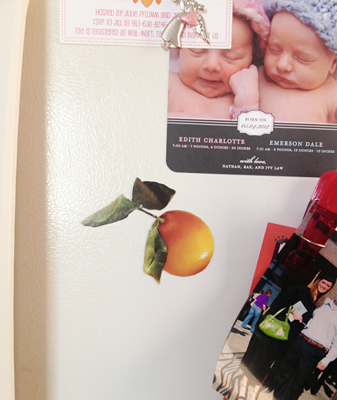
DIY martha magnets.


i had a great great weekend!
i want those weekends, every time. i didn't want it to end.


but i have a small, $2.99 diy that i did on sunday
and it only took me 20 minutes.
(and most of that time was looking through an old martha magazine from the 'archives')

easy cheap crafts are my favorite.

first, buy a sheet of $2.99 adhesive magnet for another project and get sidetracked.


days later, lazily look through an old martha stewart living on a totally gorgeous day,
with all your windows open, and not a care in the world.
(that part's important!)

this martha happened to be from april, 2010.

find the spread on citrus fruits quite beautiful and think to yourself, "self, where can i use this! i just love it!"
then rip it out.


then remember your magnet sheet that you were supposed to use for something else!


then stick them on there.
making sure it is smooth and without any bubbles.


then.
cut.


keep cutting.
keep your lines straight!


admire!


throw on fridge in your pink cottage kitchen,
on a totally gorgeous and lazy day, with all the windows open.


zoom in closer:


i love love a covered refrigerator.
it shows people live there! and their lives are important to them.

we always had our pictures and art and A+ papers on my family's refrigerator growing up and i plan to keep that going.

and my new magnets help that along.
plus they're pretty with my pink walls.
and i love them.


and do you want to see something cute?:


that's husband jay and i, on only the second day we had ever known each other.

in mexico on senior spring break. where we met. 2002.

only 18 years old and totally smitten with each other.

and that's also friend peter.
in puka shells no less.


back to the craft at hand.
don't you ever read your martha and LOVE the way its laid out?
how thoughtful they are with placement and color?
the photography?

it's like art every month in a magazine.
this time i decided to do something about it.
thanks, martha stew.


hope you had a great weekend.


love.


JILL

Monday, February 11, 2013

little did i know...


this is a long winded post. sorry.

but house and garden magazine was my first love.
first magazine love.
i was in college and in love.
before domino came out.
then domino came out, still in college, and it was my second love... but more soul consuming. those 2 still rank at the very top of the magazine hoarding love list.

then they both died.

but this morning on pinterest, i saw this image and i almost died.
(not really).

i love it.
i love the hot pink tufts.
the black and white carpet.
the oatmeal walls.
that mirror.
the pale blue and white stripes.

i have decided i'm re-doing my front navy blue room and this is its inspiration:
(i've been "over" my navy walls for a couple of months now.)


so i had to find more.
i had to see the rest of this house.

luckily pinterest said jacques grange did the design bc the link was broken and i couldn't follow it back to anything. so i googled jacques grange pink tuft and came up with this post from habitually chic.
i love the internet, you only have to ask.

it's the paris apartment of prada's mathilde agostinelli,
from a long time ago when it was published in... house and garden!
(may 2006)

the colors are less saturated than the first image and i like the first image better so i'm going with it.

then i kept reading.

look at this girls room.
i posted about it along time ago, here on the blue house bc i loved those bubble gum tufts.
(june 2011)


and then this room!
i posted about it, too bc i obssess over the wallpaper.
(august 2012)


well, as it turns out.
i love the rest of her place, too.


(you know those pink walls and myself are friendly. you can find more pink walls here, here, herehere, and here.)

well, anyway.

happy monday.
it was for me. and this all happened before 6:30 this morning.


JILL

Monday, January 14, 2013

where we eat.


not only what we eat, but where we eat it, is important.

i am drawn to kitchens/dining rooms with interest.
with details.
with stuff!! (shocker, i know)...
and not just new stuff. definitely the old stuff, too. 
the kind of things that bring a sense of history, and charm, and that lived-in quality that usually can only come with collecting pieces over time... and you know, actually living in the space.

old table cloths, antique china cabinets, chandeliers, upholstered pieces, and great art...
all great kitchens, do make.
or they at least help it out!

this is a little off the topic, but not really i guess, since we're talking kitchens...

but i foresee stainless steel appliances dating our era in the future.
will people in 20 years look back on our time and see the ss fridge like we do the old avocado ones? people on hgtv kill me while house hunting. they walk into a kitchen and bitch, excuse my french, because it doesn't have stainless steel appliances and granite countertops. ugh.

but that's another post for another day.


fill your kitchens with the things you love, and use. old copper pots look better out of the cabinet than in :)

and art loves kitchens.
in case you didn't know that.

happy monday.


JILL


{all images via my pinterest board}


Friday, December 14, 2012

chic... plywood?


it can happen, apparently.

that kitchen speaks to somewhere deep inside.
i always think color is king, but this seems so clean and fresh to me.
i know i can love both at the same time.

along with my thoughts that color = not boring,
neutral mixes = not boring, either.

this isn't even the first time i've mentioned my love for neutral spaces, or even the idea of white with wood tones... but it somehow still takes me a little by surprise each time i fall in love all over again.


see more from my past here. here. here and here if you'd like. and there's prob more that i'm just not remembering.


happy friday.


JILL

Thursday, December 6, 2012

one of my dreams.


i have lots of dream houses.
lots and lots of dream ideas floating around in my brain.

but when i saw this house in greenwich, done by jeffrey bilhuber...

i thought to myself, "self, that is one of your dream homes."

hands down.

i have said this before but when it comes to my own house and making my own decisions, i get sceeered. i know what i would want to do but then i chicken out and do a little bit less. then i see spaces like these and i think, why the hell not? i shouldn't care an ounce about what others think because they don't live there, we do. and if we are happy, then our home has fulfilled its duty.

but seriously. i want to raise my kids in an environment as
colorful and creative as this.

i'll stop talking and get you on to looking.
but it's good.

(and you'd never gather it was that spunky from the outside)


(this kitchen is my favorite!)


all very traditional shapes.
but done in a not so traditional colorway.

bright blues and purple.
orange and yellow.
pink. red.
toned down in toile and stripes and florals, with different shades of brown.

i could go on and on.
it's pretty great.


and as for my sparkly gift guide i had ready for you this morning...
my computer and i aren't on the best terms as of late, because it ate it.
it's nowhere to be found.
not in the folder where i left it last night.
not in the 'recycling bin'.
done-zo.
so i'll re-gather those things and hopefully have it for you tomorrow.
stupid thing.


happy thursday.

JILL

Friday, November 16, 2012

in a land of color....


sometimes less color is a little bit more.
and i have to remind myself that, here's why:

cool neutrals mixed with warm neutrals.

even without an overload of colors,
a perfect mix can still feel very textured, very full, very colorful.


to achieve this yourself:

mix shades of grey with wood, copper, brass, gold, cream, camel and/or brown.


(and i'm telling you, brown and grey is one of my favorite combos.)


JILL


and sorry for the lame blogging this week.
no excuses.

will do better.


happy friday.


{images via apartment therapy, brittany stiles, brittany stiles, west elm blog, marcus design, inc, and the niagra novice}